Homa® Furniture
Branding Case Study
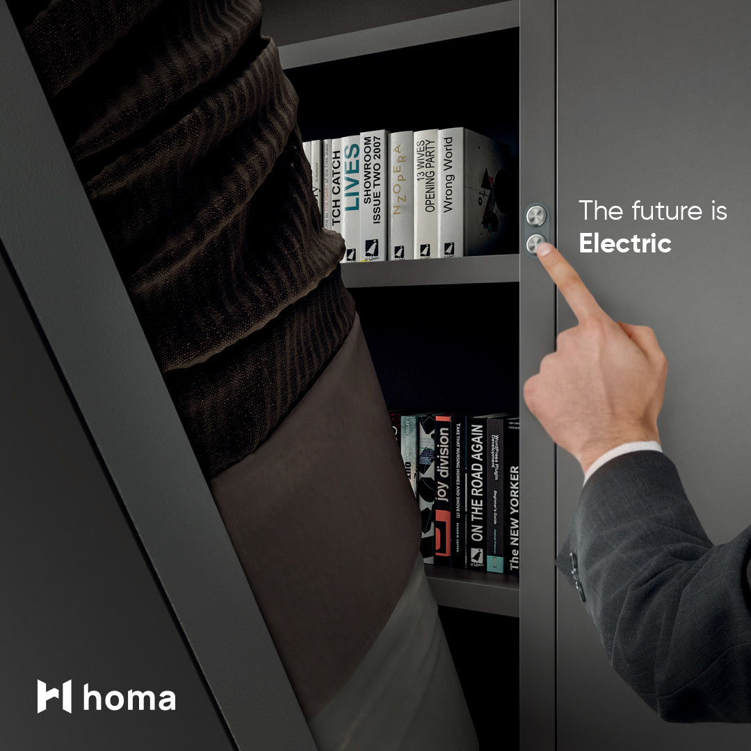
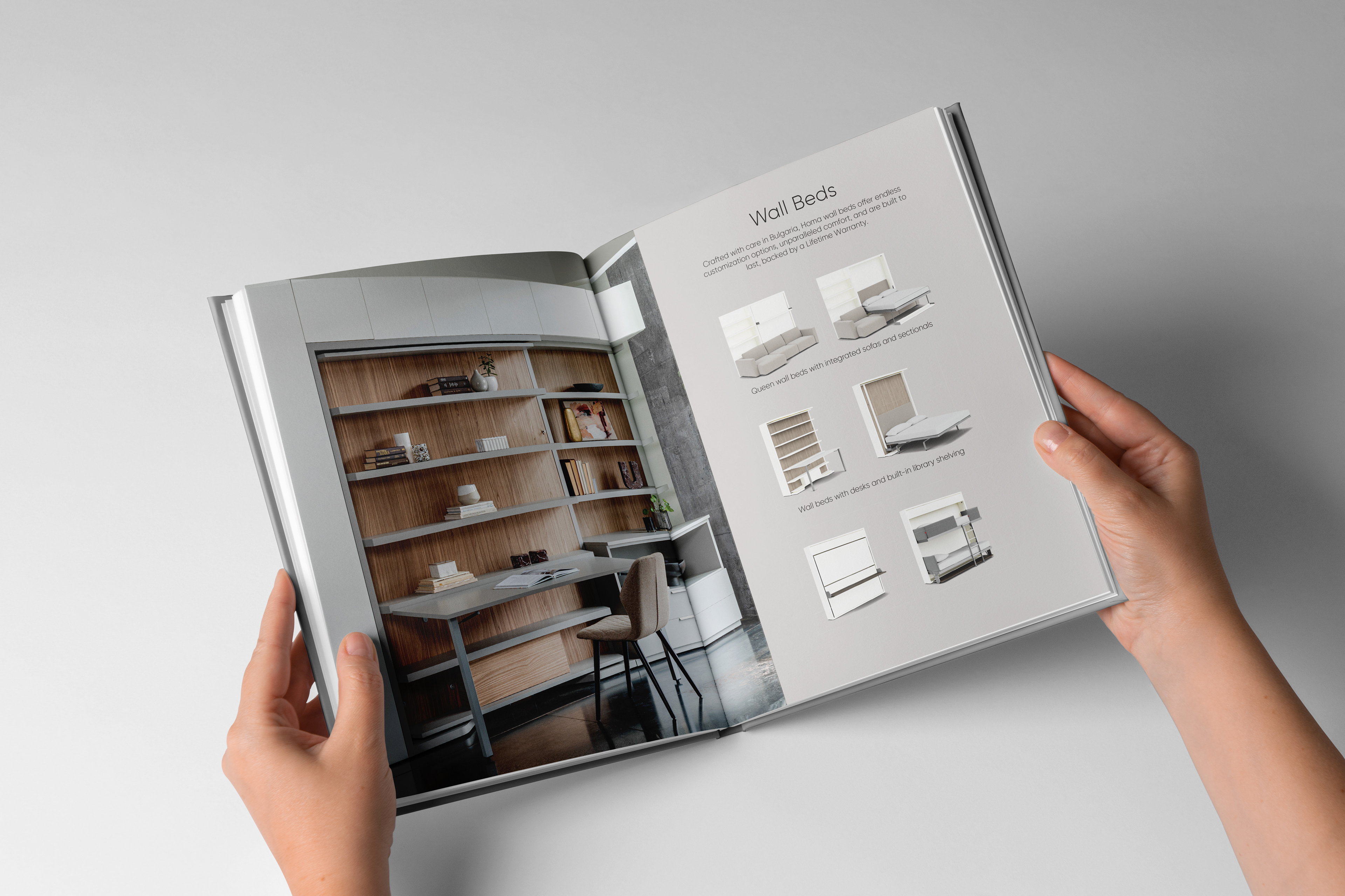
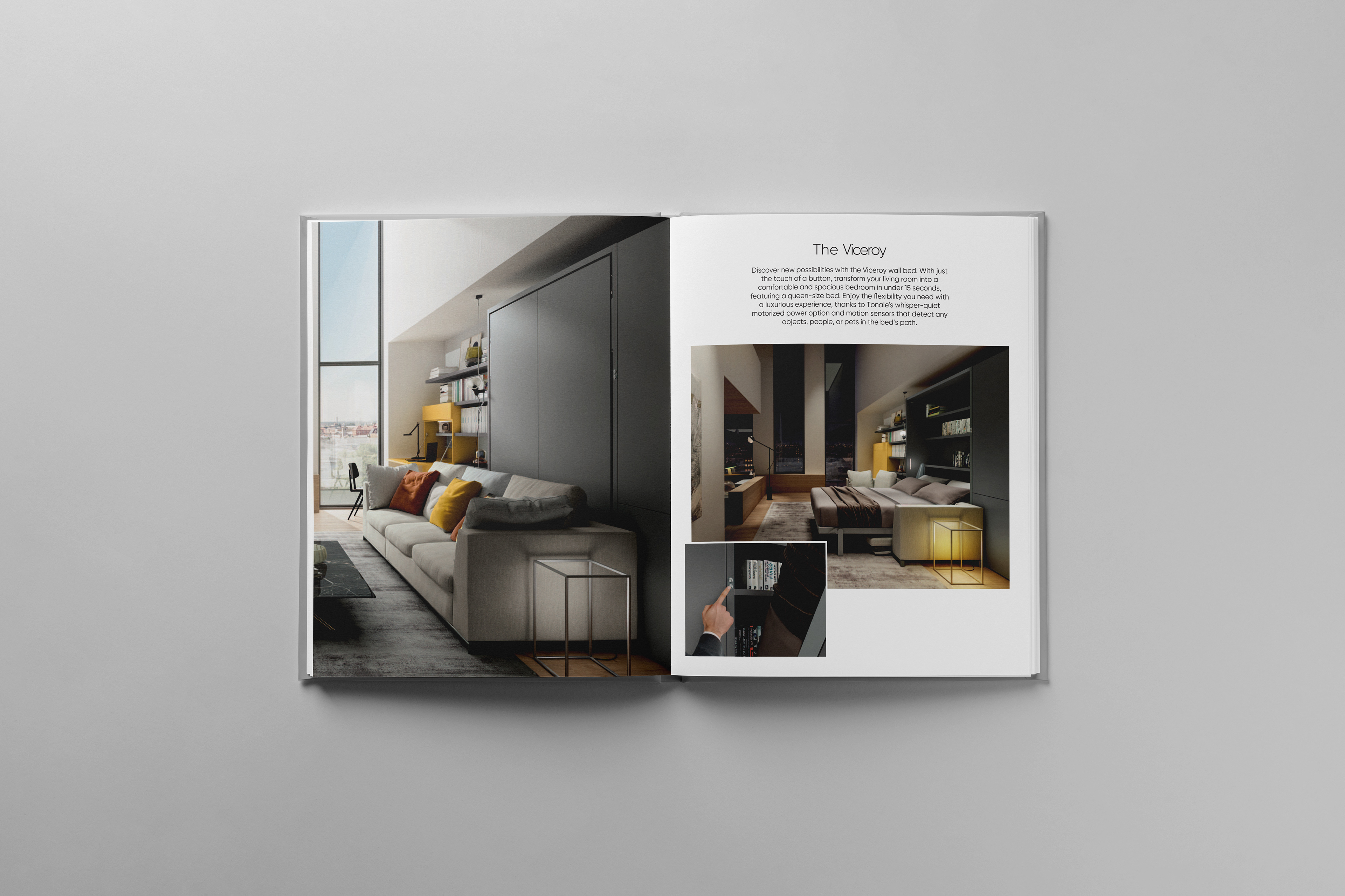
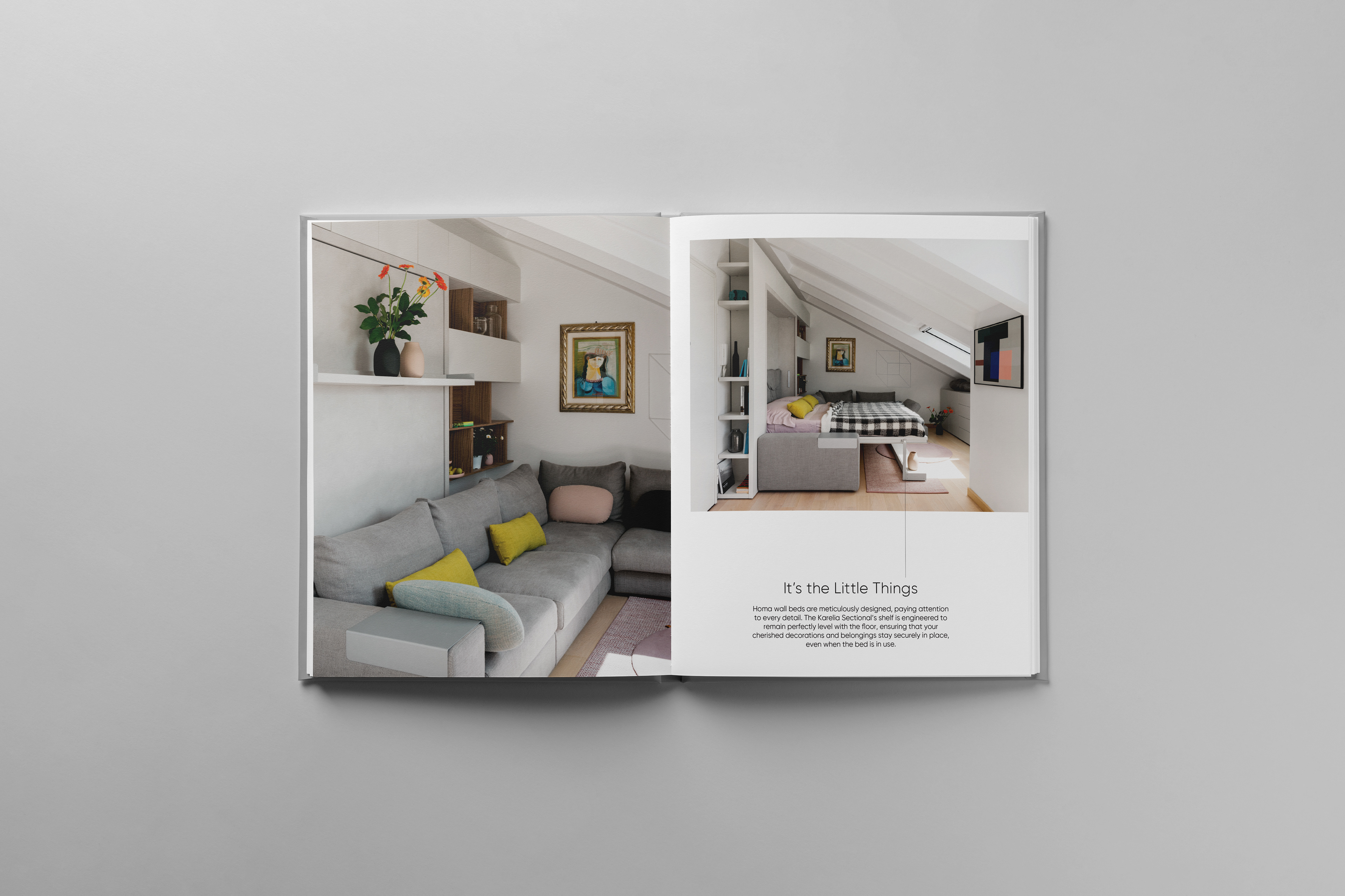
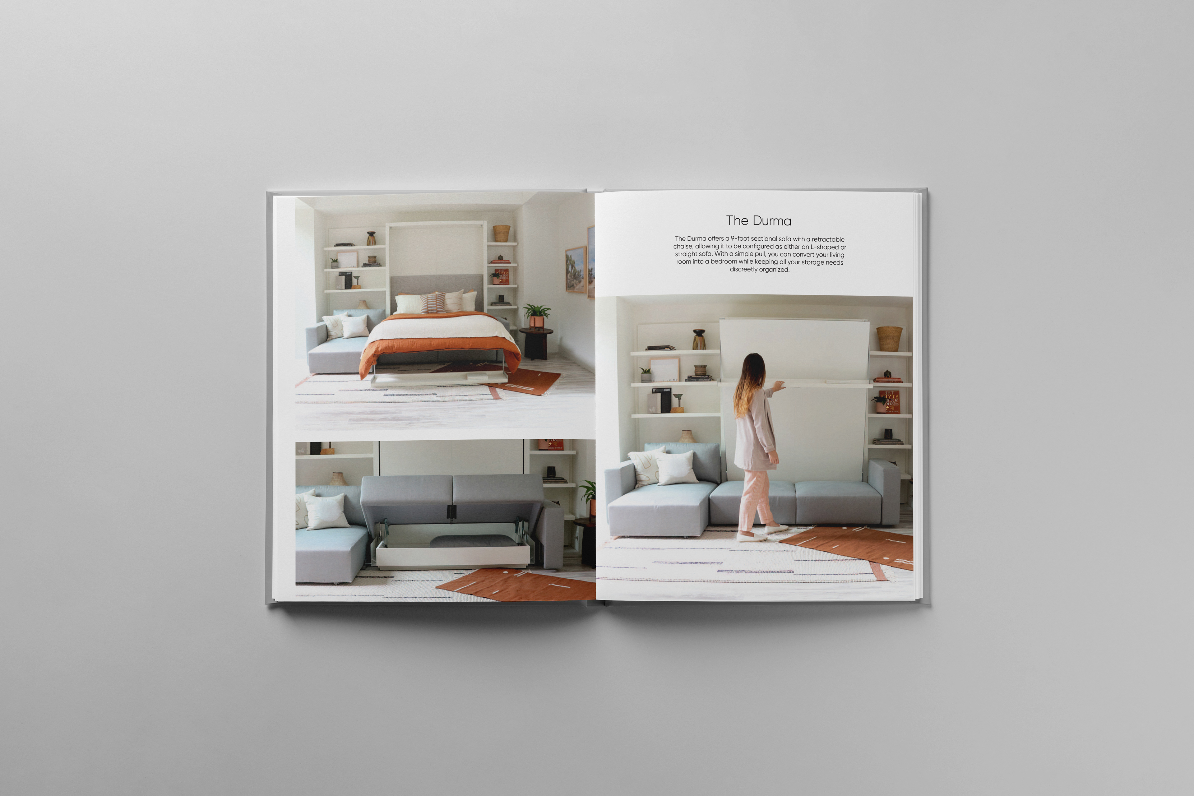
Homa is a forward-thinking company specializing in modern transformable furniture that adapts to any living space, without compromising on style or craftsmanship. With a focus on maximizing space, their offerings range from ready-made pieces to custom furniture solutions. They also provide interior design services, ensuring each project is tailored to their clients' unique needs and tastes.
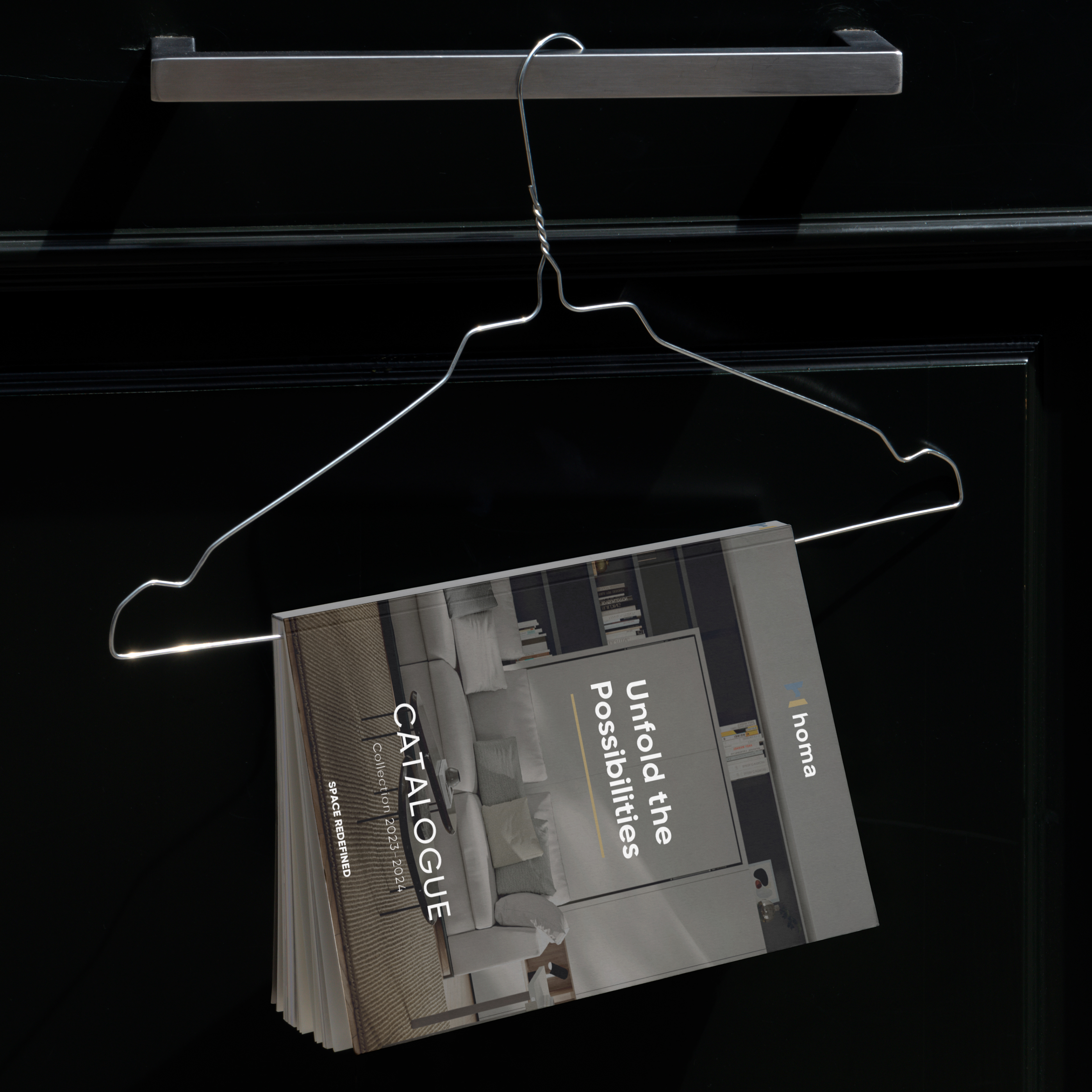
The goal was to develop a brand identity that reflected Homa’s blend of innovation, functionality, and design excellence. The branding needed to convey both the practicality of their transformable furniture and the elegance of their craftsmanship. A key part of this was using a pastel gold and warm blue color palette to create a look that felt both modern and inviting.
I began by developing a sleek and adaptable logo that symbolized Homa’s core concept of transformation. The design drew on geometric elements to suggest movement and flexibility, which aligned with the company’s modular and adaptable furniture solutions. The pastel gold and warm blue color scheme was chosen to evoke a sense of warmth and luxury, while still being fresh and contemporary, striking the perfect balance between elegance and approachability.
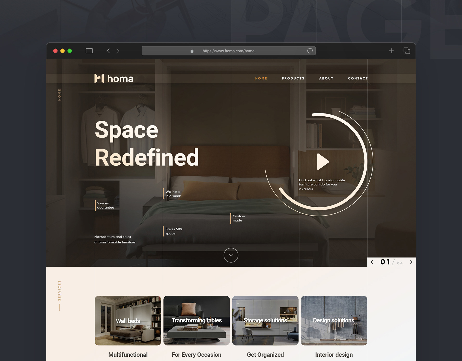
For the digital presence, I designed a one-page website layout with a clean, modern aesthetic. The layout was user-friendly and featured high-quality imagery of Homa’s transformable furniture in action. By focusing on minimalistic design elements, the website allowed the products to take center stage, while the gold and blue accents maintained a cohesive brand feel throughout the digital experience.
